
Art
SCHEMING IN A COLORFUL WAY! PART 2

There are so many areas of our life that are touched by color, but sometimes it’s hard to choose what those colors will be or even where to start. In part one of “Scheming in a Colorful Way,” we discussed some of the most common ways to choose a color scheme, based on color theory. In part two, we will continue to explore color schemes and examples of how artists use them in their work.
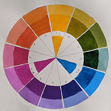
Picking up from where we left off, the next scheme to discuss is split complementary, which is made up of three colors. First, you find one color, say orange, and then its complement, blue, but instead of using blue, you find the two colors that border blue, blue-purple, and blue-green. So, your split complementary color scheme is orange, blue-purple and blue-green.
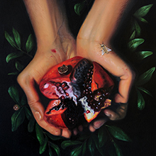
For example, “The Middle” by Bella Falbo features another split complementary scheme: red, yellow-green and blue-green. The rich red in the pomegranate is emphasized by the yellow-greens and blue-greens in the surrounding leaves.
Another is the triadic color scheme. To find triadic colors, look for three colors that are equal distances from each other. An example could be red, blue and yellow.
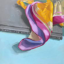
Another example could be yellow-orange, blue-green and red-violet in the piece, “Silk Scarf and Bonnard” by Michelle Wilcox. The yellow-orange and red-violet in the scarf look harmonious next to the greenish-blue ground it lays on.
And the final common color scheme is tetradic. Tetradic color schemes are made up of two different complementary color pairs, chosen so they form a rectangle on the color wheel. For example, a tetradic scheme could include red, red-orange, green and blue-green.
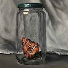
This tetradic color scheme is seen in the first panel of “Sealed for Freshness” by Bella Falbo. Here you can see the pops of color in the composition are the red and red-orange in the strawberry, the green of the leaves and the blue-green of jar’s lid.In this column, we discussed split complementary, triadic, and tetradic color schemes. Choose colors that suit your mood, or to make an impact, choose one bright color and other muted colors.
Next time you visit an upholstery store, art gallery or plant nursery, take your color wheel with you.
Brinda Pamulapati, owner/managing director, of Venvi Art Gallery in Tallahassee, can be reached at (850) 322-0965 or visit www.VenviArtGallery.com