
Art
SCHEMING IN A COLORFUL WAY! PART 1

From the color of your walls to the colors of your furniture, to the artworks that decorate your spaces, they all have an impact on the mood of your home. And all are a great way to express your unique personality and taste. When decorating, sometimes its hard to pick a color but its helpful to know the basics of how artists choose colors for their work.
Artists carefully choose the colors they use, tending to use similar colors or color schemes throughout their work to create a sense of harmony. In this two-part series, we will discuss some of the most commonly used color schemes.
The first color scheme to discuss is monochromatic, where the artist creates different tints and shades of color but maintains the same hue.
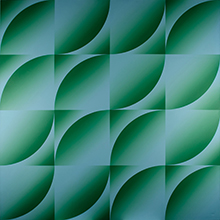
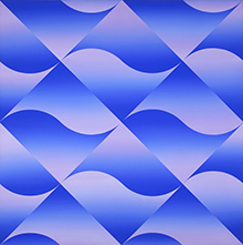
For example, in the pieces Undulation and Blue Ripple, the artist Ray Burggraf has used various shades and tints of green and blue, respectively, with lots of contrast and form to move the viewers eye across the piece.
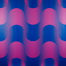
The next is analogous, meaning the colors in this scheme are adjacent to each other on the color wheel. An example of this is red and orange or blue and purple. Artists can create interesting combinations using darker or lighter shades and tints from these analogous colors as well.
.jpg)
For example, in Candy Apple Pink, the analogous colors used are blue and purple. In Heartland Roo, yellow and green and blue and purple are used.
Another scheme is complimentary colors, or colors that are opposite each other on the color wheel. For example, blue and orange are complimentary colors, as well as red and green.
Mark Messersmith uses vibrant blues and oranges in in his artwork Study For: In search of Shadow Land.
One needs to first understand the rules of colors to use them efficiently or gracefully break those rules to design a harmonious living environment.
Look for part two in my next article about, split complimentary, triatic, and tetradic color schemes. But no matter what the scheme, choose artwork that speaks to you. There is not a right or wrong, whether you like monochromatic, analogous, complimentary, split complimentary, triadic, or tetradic color scheme, the color scheme should resonate with you just like music would.
Brinda Pamulapati, owner/managing director, of Venvi Art Gallery in Tallahassee, can be reached at (850) 322-0965 or visit www.VenviArtGallery.com