
Composition and Negative Space

Why do some works of art appear more attractive than others? The answer can be found in the elements of artistic composition, such as form, color and texture. In addition to these aspects of composition, negative space, or the empty area around and within an object, is a useful if tricky tool to make a work of art beautiful and monumental.
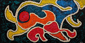
Empty space can accentuate an artwork’s subject, reduce distractions, and make the image more compelling. In Terrie Corbett’s 1000 Kittens Purring, for example, multiple bright colors make up a positive space, while a white area frames and defines the outline of the abstract forms. In this way, the negative space guides our eyes to the central focus of the painting.
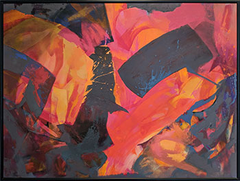
The contrast between positive and negative space can also create dynamic tension. In Keith McCulloch’s Swoosh, the darker areas are the negative space, while the bright orange and fuchsia together constitute the positive space. The bold contrast of positive and negative space creates a striking effect. Due to the artist’s effective use of negative space, we appreciate this composition without much mental effort.
Overlapping Positive and Negative Space
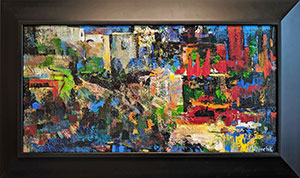
An artist can create an eye-catching composition by thoughtfully alternating positive and negative space. By controlling the contrast between the two, the artist may give visual forms a particular meaning. For example, Eugen Denchik’s Interpretation I carefully balances negative and positive space to create the impression of a cityscape.
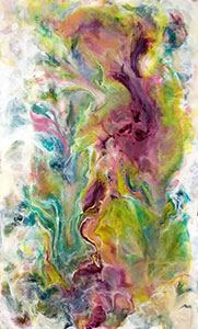
In other cases, the positive space may overtake the composition, minimizing the negative space. In Varda Lantsman’s painting, the negative space has a hazy, even vague, quality that enhances, sharpens and beautifies the image.
Our reaction to a painting depends upon the context in which we experience its qualities of light, dark, sharpness and haziness. A crucial aspect of painting is the relationship between positive and negative space, and it’s up to artist’s skill to make the artwork interesting by intelligently using these elements to draw the eye, create a balance or overlap, or produce a striking contrast.
Brinda Pamulapati, owner/managing director, of Venvi Art Gallery in Tallahassee, can be reached at (850) 322-0965 or visit www.VenviArtGallery.com